Monday, 24 October 2016

OUGD402 - Group Task - Identity

Group exercise on how others perceive us. 
Everyone in the group was asked to write down a few words or phrases about every other member in the group about their personality and appearance, ultimately showing how we see them.

Words used by others to describe myself:
  • Honest
  • Friendly
  • Reliable
  • Caring
  • Considerate
  • Determined
  • Truthful
  • Punctual
  • Lovely
  • Polite
  • Infectious laugh
  • Quotable
  • "The Ron Burgundy of Graphic Design"

At first consideration, this task seemed challenging as some members of my group I had only ever spoken to once or twice when briefly introducing myself at the start of the course, so it was hard to judge these individuals not knowing their personality that well. This therefore meant that my judgements were solely based on appearance and the small amount of conversation I had with these individuals before the group task.

I feel many of the words used by other group members to describe myself are mostly truthful and would naturally consider using them myself to describe my personality. For example, many words suggest I am perceived as a trustworthy, friendly and approachable person which I generally consider myself to be. However, it was hard to tell whether everyone in the group was being completely honest for fear of sounding rude.

Other words from people whom I have gotten to know better throughout the course so far gave words and phrases such as 'has an infectious laugh' and 'quotable' due to my tendency to laugh a lot, and to spontaneously say stupid things and quotable one-liners, hence the phrase "The Ron Burgundy of Graphic Design" which makes reference to the film Anchorman. 

These words and my perceived appearance will be of help to me when introduced to the self-branding project, as not everything will be coming from myself and be so one-sided now that I have an idea of how others see myself as well.

Sunday, 23 October 2016

Offset Sheffield - Saturday 22nd October 2016 - Droga5

Droga5 are an advertising agency based in New York. Their talk suggested that what works best within advertising is abstract elements which do not necessarily push the story along, but gets people thinking. For example, Under Armour, Phelps ad uses abstract scenes to communicate a sense of wonder and inquisitiveness. In this, they remind us that people do not love advertisements, they're a disruption and so people are not willing to engage with them and this must be broken in the first instance to create an effective ad. This requires conceptual thinking as an essential element that usually informs every creative decision, and links to their decisions in the production this ad.
Their talk also provided lots of advice in relation to the idea that advertising is all talk. Using a quote from Gerhard Richter "you can only express with words what words are capable of" they provided ways of how to get around the problems of having to talk about your work before it even exists. The first point is in regards to referencing - use visuals and sounds to illustrate mood, how should the ad feel? For example, their ad for Under Armour, I Will What I want, uses breathing sounds and the sound of both positive and negative comments being smacked onto walls, which was very effective in communicating mood and meaning without necessarily talking. Prototyping is also important - you should create something before you show it, get a sense of how it will work. Conceptual thinking - ideas that can be talked about easily, 'to illustrate x we must do y', must be clear and simple as ideas are described and interpreted differently by various people.


Offset Sheffield - Saturday 22nd October 2016 - Laura Carlin

Laura Carlin is an illustrator and ceramicist based in London. Her main sources of inspiration come from books, film design and characters. Despite this, she believes that you should step out of your comfort zone every so often in terms of inspiration and style of your work, as you do not necessarily have to like a certain piece of artwork but you may be inspired from the idea behind it. Her illustrations for The Iron Man, a children's book by Ted Hughes, is ... of this belief. These illustrations include subtle differences and ideas which you have to pay close attention to notice. For example, in the book she gave the iron man a shadow and not the townspeople to show their ignorance towards the man. However by the end of the story every character has a shadow when they are finally able to accept the man for who he is. Carlin believes that illustrations like these plant seeds of imagination in the minds of children, therefore no topic is off bounds and you should not steer away from difficult subjects. Children are the harshest of critics and understand more than you think. However, for the children to be engaged with a story, the characters must be believable as a real character. Giving them small narratives in their creation gives them this essence of 'realness'. This idea can also be seen in her own book, A World of Your Own, which is aimed to encourage children to draw, create their own narratives and overall spark their imagination.


Offset Sheffield - Saturday 22nd October 2016 - Florence Blanchard

Florence Blanchard is a visual artist, painter, screen-printer and curator. Trained as a scientist with a pHd in Biology, inspiration for Blanchard's work comes from microbiology, molecules and cell membranes. She combines her science background with art to create large murals using contrasting, bold and abstract colours. Illustrations are typically produced using circle paper as if looking through a microscope or into a petri dish. Her love for painting was developed through graffiti. This background in graffiti still informs a lot of what she does, typically painting murals within industrial spaces or warehouses, such as a burnt down recycling facility, to change people's perception of them. For example, one project of hers was a mural in Hokkaido, Japan on an old building which was set to be demolished. This mural changed people's perceptions of the building and as a result, plans to demolish the building were set aside, showing how Blanchard's work has a heavy impact on such environments.


Saturday, 22 October 2016

Offset Sheffield - Friday 21st October 2016 - Pentagram

Pentagram is an independent design company based in London, New York, Berlin, Austin and San Francisco, made up of 21 partners who each run their own individual teams. The company focuses on various fields of design, such as architecture and interior, books, branding and identity, film and websites. Their talk aimed to showcase some of their recent works integrating invaluable advice within. One recent project of theirs focused on the relationship between alphabet and image. Taking inspiration from Edward Johnston, famous for designing the typeface used throughout the London underground system until the 1980's, Pentagram produced a set of ios 10 stickers which integrated the use of emojis with ligatures. This project was of much interest, especially since it related to our recent ligature project. It showed how they have used modern technology to almost create a global language for communication through text abbreviations based on the idea of emojis. Advice taken from this project was to embrace technology within your design practice, as it can have a huge impact on communication as shown in their ligature ios stickers project. However, technology is not the only thing you should embrace. Collaboration is also important. Collaboration creates varied and considered ideas within a project which can help to inform final results, but the process also teaches each other new skills that as a result can inform your overall design practice and help you to consider different approaches to work. As a designer you must embrace and engage with ideas such as these, including 'stupid' ideas because you never know where these may take you and it could all be worth it in a few years time.

Pentagram's Leeds Design Festival 2016 poster designs.


Identity work for Philadelphia Museum of Art.

Offset Sheffield - Friday 21st October 2016 - Moving Brands

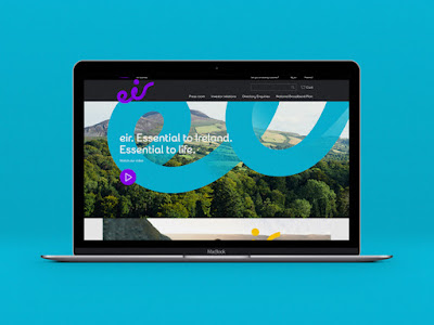
Moving Brands is a design company based in London, Zurich, San Francisco and New York. The talk, with executive creative director Darren Bowles, was called 'Creativity for a Moving World' and was designed to give advice that aims to aid designers in further developing their practice. The main consensus was that design has become too clean and refined, meaning it loses quirkiness and opportunity. Design needs to be a messy process for it to end up beautiful, meaning it also needs a good balance between what is considered right and wrong in terms of design. Moving Brands illustrated this through their design for Eircom, a telecommunications service based in Ireland. Shortening the name to Eir, Moving Brands focused on what is essential to Irish life, capturing the properties of air and using film as a medium to capture tone. 
To be 'playful and seemingly pointless' is another important aspect of design suggested in this talk. Experimentation with a wide range of materials and methods provides interesting ways of gathering ideas and allows you to uncover things which previously may not have been known or thought about. You should be unapologetically experimental and let your clients engage with your work in a way that challenges accepted norms. For example, when pitching an idea to a client, Moving Brands often use large foam boards as a way to get the client interacting with their ideas.