6A2 / 6C2 / 6D2.
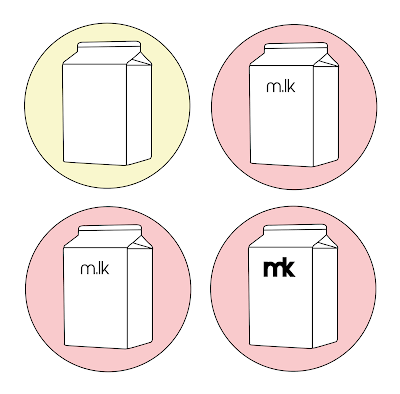
In starting to develop my personal branding, it was decided to initially focus on developing the milk carton idea since it was thought that this would create a playful and interesting logo. An initial outlined sketch was first produced, which was then manipulated in its size so that this would fit better within a smaller space, such as on social media, my website and other branding material. This illustration was then placed within a circular shape in order to get a feel for this space, as well as continuing to create the friendly nature discussed in initial ideas and sketches. Due to milk cartons and milk itself typically being white in colour, it was decided this carton should be filled to match these aesthetics, however this meant placing it on a coloured background to make this image stand out more rather than appearing as a simple outline. Lighter, pastel colours were experimented with in these developments as a background colour, which were thought to have a softer nature which would convey my friendly personality and the colourful nature of my work. Within this illustration, type was experimented with, using minimalistic styles which featured my initials placed on the carton as if a label.
Based on initial ideas, another development in my personal branding was utilising handwritten type produced physically by myself, experimenting with joining letterforms together. These developments focused on using san-serif type characteristics in attempting to create a minimalistic and modern looking logotype. It was thought that joining these letterforms together, particularly in the last variation which includes the upwards stroke of the letter 'K', created a unique way of conveying my identity through my initials, with the upwards stoke of the 'K' also acting as a lowercase letter 'L' representing my middle name, whilst the 'M' and the 'K' still appear distinguishable in their own right.
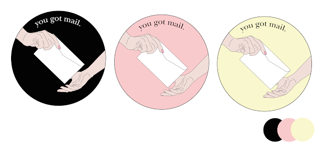
In addition to my logo, other branding material was also initially thought about and developed, thinking about how illustrations could also feature in some instances, such as on letters, emails and packages sent out to studios and agencies, as well as potential clients. It was thought these would give the audience an initial glimpse into my creative practice through this use of illustration, as well as a subtle way to grab someone's attention straight away. The illustration featuring two people exchanging letters was produced in order to show my openness to collaboration and would feature a similar colour scheme to my logotype in the use of pastel colours with small additions of black to help certain elements stand out amongst each other.
It was considered that these additional branding illustrations would work effectively in their design and reasons for being produced, however the initial logo developments were thought to not work as consistently with these in terms of their style. Therefore a different approach was taken in further developments, creating logo variations which appeared more delicate in their style through thinner stroke weights and utilising a serif typeface rather than the initial bolder san-serif type style. It was also thought that this new type style better communicated certain elements of my creative practice in terms of traditional print methods and taking a more hands-on, analogue approach in response to certain briefs. These developments, however, took on a similar form to that of previous developments through the way in which letterforms have been joined to become one, but still allow both the 'M' and the 'K' to stand out in their own right depending on how the logo is viewed, almost creating a sort of optical illusion effect, which would potentially create an element of engagement between the audience and this logo.


No comments:
Post a Comment