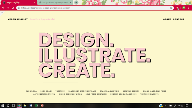
A few initial ideas for my new website design was on the homepage to have a slideshow of selected projects with type overlayed onto this, or to have a blank page with type overlayed in my branding style which alternates between the three words in my tagline 'design, illustrate, create' and provide links next to each of these words to redirect the user to individual portfolios of projects related to that discipline. Another initial idea was to show the full tagline on the homepage instead and provide a link to a general portfolio of work.
In starting to develop a new website, it was decided that this should remain consistent with other elements of my personal branding, such as my business cards. On the homepage it was therefore decided to feature the same tagline as featured on my business cards to show the user straight away who I am as a designer. The job title given to myself in a session on designing your own job was also added to this homepage next to my name for a similar reason and to get the user more interested and engaged with my practice.
Based on both feedback and visual research into existing websites which suggested that things look better and more structured if consistent in style, it was decided to create icons based on each project which I would feature on my website which could then be placed together in my 'portfolio' section of my website to show a consistent style until an individual project which was clicked on which would redirect the user to another page specifically for that project with a series of consistent images within each separate project page. These icons were designed to be consistent with the colour schemes of my personal branding, utilising mostly pink and black which is featured within the type designs of my branding, along with some hints of yellow as featured in the background for imagery that needed a bit of distinction between elements.
How icons were initially used in website development:
However, the projects were also featured on the homepage, placing these here for easy access to each project from the homepage. For this reason, it was decided that the 'portfolio' page was not needed and so instead of using the developed icon imagery it was decided to develop typographic titles for each project in a consistent style to my personal branding tagline type style which would show up when the user hovers over the project title on the homepage. This was thought to create a simple, but impactful experience when interacting with the website homepage.
Examples:
How titles have been used in website development:


No comments:
Post a Comment